Excel’s® built-in method to add custom error bars to charts is rather complicated. Daniel’s XL Toolbox provides a simple way to add “smart” error bars to your graph with a single mouse click.
You can either use the Smart Error Bars function in fully automatic mode, or in Interactive Mode; for the latter, see the dedicated page on Interactive Mode.
Fully automatic mode
To use the fully automatic mode, simply select your chart and click on the Ribbon (Excel® 2007-2013) or toolbar or menu (Excel® 2003) button. It does not matter whether you have selected a bar graph or a line graph, or a combination of both.
The XL Toolbox will automatically locate your custom error data below or to the right of your chart data, depending on your preference.
In the Preferences dialog, you can also set the desired offset, i.e. how many columns to the right or how many rows below the data the Toolbox should look for the error values.
After adding the error bars to your chart, the Toolbox will select and highlight the corresponding cells on your spreadsheet, so that you can verify that everything is correct (see example).
Error bar direction
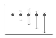
The XL Toolbox automatically determines the best combination of positive and negative error bars with the least overlap. If you prefer to always have either positive, negative, or bidirectional error bars, you can change this setting in the preferences.
A similar logic is applied to bar graphs: If a data series has positive values only, it will get positive error bars which do not “reach into” the bars. Negative data gets negative error bars. If a data series has both positive and negative values, the error bars will point in both directions.
Advanced automatic mode
The Toolbox also offers an advanced automatic mode. You can enable this mode in the preferences.
When advanced mode is enabled, the Toolbox no longer uses a simple offset-based algorithm to determine which cells contain the error values. Instead, it looks for empty cells that delineate your chart data. The advantage of this becomes clear when looking at this example:
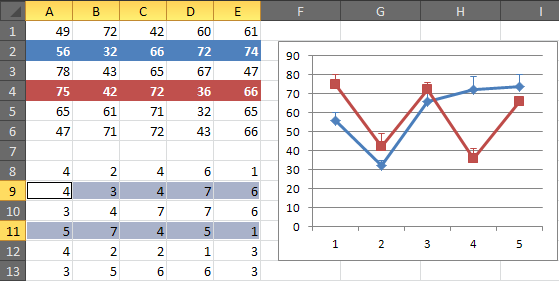
In this example, the chart depicts two data series, which are taken from a larger block of data. The data series are highlighted in blue and red. A simple offset-based detection mechanism would erroneously locate the error values just below the two chart data series. The advanced algorithm however correctly identifies the empty cells below the data block as delineator, and chooses the corresponding rows in the block below as error value source.
Error bar preferences
Please see error bar preferences.
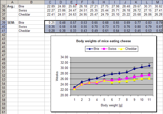
Chart after using the error bar function
After applying error bars, the cells chosen for the error values are highlighted.
Interactive Mode
This page describes fully automatic mode. Click here to learn how to add error bars in Interactive Mode.
Situations where the error bar color and width cannot be set
When you create a chart, Excel will automatically apply colors and line styles (see screenshot, right). These ‘automatic’ color settings cannot always be read by Excel addons; the XL Toolbox may be totally ‘blind’ to the automatic color and line styles such as line width. This behavior is different between the different versions of Excel.
If you find that the error bars do not receive the formatting that you want, you can either apply the color and line formats manually to the error bars; or you can assign a different color to the chart series itself (i.e. the lines or the bars). The XL Toolbox will then be able to read the user-assigned color and line style from the chart, and apply them to the error bars.
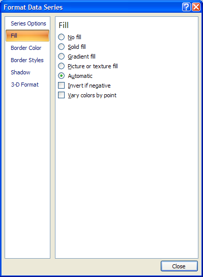
Excel sets the chart colors to ‘automatic’ by default.
Excel sets the chart colors to ‘automatic’ by default.
Independent values for ‘plus’ and ‘minus’ bars
If you want to set independent values for the ‘plus’ and ‘minus’ error bars, you need to use the Interactive Error Bars.
Independent ‘plus’ and ‘minus’ error bars can be applied using the interactive error bars function.