The Annotate Chart function provides a simple way to add comments and color to individual data points in your chart. For example, you can easily highlight specific points in a scatter plot, or you could add asterisks (“stars”, “*”) to a bar graph with a mouse click to denote statistical significance.
Colors are taken from the data cells that belong to the chart. You can choose to ‘ignore’ black and white, so that unformatted data cells (black text on white background) will not cause your graph to have all black datapoints.
Annotations (labels) can be read either from the cell comments or from a separate range of cells.
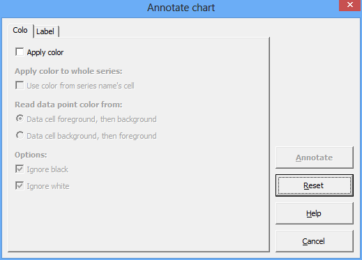
Options
The Annotate Chart dialog offers the following options (see
screenshot)Color
Data points assume the color of the corresponding cells on the spreadsheet.
- Apply color to whole series: Check this box if you want to apply one particular color to a whole chart series, including the line between the data points, if a line is present. The color is taken from the cell that contains the chart series’ name. If the chart series does not reference a cell to obtain its name, this option has no effect. Since the color for the whole series is applied first, you can still selectively add color to specific data points by changing the color if the respective data source cells.
- Read color from foreground, then background: If set, each data point will assume the color of the text in the corresponding spreadsheet cell. If this color is an ‘ignored’ color (see below), the background color of that spreadsheet cell will be taken instead. If this background color is an ‘ignored’ color as well, the data point’s color will not be changed at all.
- Read color from background, then foreground: If set, each data point will assume the background color of the corresponding spreadsheet cell. If this color is an ‘ignored’ color (see below), the text color of that spreadsheet cell will be taken instead. If this text color is an ‘ignored’ color as well, the data point’s color will not be changed at all.
- Ignore white/black: If set, white or black colors of either text or background will not be copied to the chart. These options are checked by default, because in most cases one will not want all chart data points to assume the black color of the text in the cells.
Labels
- Read labels from comments: Labels for data points will be read from the comments of spreadsheet cells. (To add a comment to a spreadsheet cell, right-click into the cell and choose “Add comment…” from the menu.) Since Excel will automatically insert your current username into the comment, followed by a colon, you can select Strip text before first colon so that your name does not appear in the chart labels.
- Read labels from cells: Allows you to enter a custom range of cells, whose contents will be taken as data point labels (see the example below).
- Clear all labels first: Self-explaning option.
- Apply to last data point only: This option is particularly useful for line graphs in conjunction with “Read labels from cells”, if you want to make the labels appear as labels for a whole line rather than a particular data point. See the image to the right as well as an Example at the bottom of this page.
- Format significance symbols: If you use labels to add symbols of statistical significance to your chart (e.g., asterisks “*”), you can check this option to have them formatted in a bigger font automatically, as the standard font size is usually quite small for these symbols.
Annotate chart and add color
Annotate charts
Example
The example left demonstrates how the Annotation feature works: The chart has two chart series: 1, 3, 5 in column A, and 4, 3, 2 in column B. In addition, there are some cells below the data from which the labels for the data points are to be read.
- Colors: Colors were taken from the cells that contain the chart
data. Thus, in the first series, the first bar was painted green, and
the second bar was painted blue. The third bar was not touched, because
the corresponding cell (with the value 5) has the standard black text on
white background.
For the second series (4, 3, 2), the text colors of the source cells were ignored, because they are white or black. Instead, the background colors were used. - Labels: The labels in this example were read from a user-defined range of cells (A5:B7). As you can see, the formatting of the text was applied to the chart labels, too.
Apply labels to last datapoint only
For line graphs, it is sometimes desirable to apply labels only to the last (rightmost) data point, so that it looks like the label applies to the whole line:
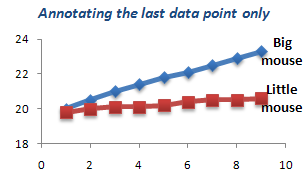
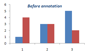
Chart before annotation
Before
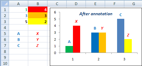
Chart after annotation
After
Tip: Quickly reset data points (Excel® 2007)
Right-click a data point in your chart and choose “Reset to Match Style” from the menu that pops up.