Scatter plots are often preferred to bar graphs to show individual data points from different treatment groups. However, when the data points within one treatment group overlap, information gets lost, and the graph conveys a misleading message. The Spread Scatter function helps in this situation by pulling apart the individual data points horizontally.
You can see the effect of the Spread Scatter function in the logo picture at the top of this page. The graph shows two groups of exactly the same data. The left group has many data points that are superimposed. For the right group, these points have been spread out horizontally, enabling the reader to get a more accurate impression of how the data is distributed.
How to use the Spread Scatter function
Using the Spread Scatter function is very simple:
- For each data point to be plotted on the Y axis, create a “category” entry in a cell next to it (see picture to the right). Your first group will be category 1, the second will be category 2, and so on.
- Select the cells and create an XY scatter plot.
- Click on “spread scatter” in the XL Toolbox menu or on the ribbon (depending on your version of Excel).
- In Excel 2003 it is unfortunately not straightforward to add text labels to the X axis. All you can do is delete the numbers on the axis and insert text boxes. – In Excel 2007 you can add a second series to the chart, change its type to a Column chart, make it white so it is invisible, open the “Select Data” dialog for the chart, select the new series, click on “Edit Axis Labels”, and then select the cells that contain your group names.
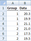
Data input for a spread scatter
Data input for the spread scatter function.
Changing the source cells vs. unlinking the chart
Spreading a scatter plot is accomplished by changing the values in the cells for the X axis so that the data points are spread out along the X axis. You normally do not see the effect, because the number formatting in those cells is adjusted to not show any decimals. But if you select a cell and look in the formula bar, you will see that it is actually not a whole number.
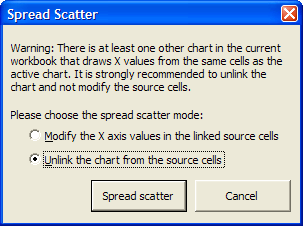
If two charts draw their X values from the same cell range, spreading the scatter in one chart would automatically alter the spread in the other chart too. The XL Toolbox will detect this situation and notify you about it (see screenshot).
You can then decide if you want to unlink the chart’s X values from the source cells.
When you unlink a chart, the X values for the chart series will be written directly into the series formula:

You can repeat the Spread Scatter procedure on this chart, but changing the source cells will of course no longer affect the data points’ X values in the chart. Note however that the Y values will always be linked to the source cells!
Setting the default behavior
You can set your preferred Spread Scatter operating mode in the Preferences. This is also where you can adjust the maximum spread width.
Spread width
The Spread Width indicates how far data points can be spread around their category center. A spread scatter of 0.5 means that data points can be moved by -0.25 and +0.25. The maximum allowable scatter is 1.0, where points may be spread out so far that they touch the data points of the neighboring categories.
Spread Scatter dialog
Spread Scatter issues a warning if two charts point to the same cells.