Creating charts with labeled data clouds
Scatter plots are a great way to visualize groups of data. Compared with bar graphs (with or without error bars), they have the added advantage of showing how the data are spread out. However, the basic scatter plot that Excel creates needs some tweaking to get it right.
In this tutorial, I will demonstrate:
- how to create grouped scatter plots,
- spread out the data points to generate data ‘clouds’,
- and add labels to the groups or ‘clouds’ of data (this requires Excel 2007 or later).
Briefly, the XL Toolbox is used to spread out the data points, and then a hidden bar graph will be added, which serves to add labels to the chart.
Step 1: Generating the scatter plot
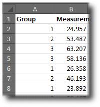
To create the scatter plot, you need to have all your data in one column; you also need another column which contains whole numbers designating the individual groups. For example, if you have three groups of data, your table layout may look like in the screenshot on the right.
(Tip: If you would like to try this with random sample data, you can generate any amount of random data using the Analysis Toolpak, which comes with Excel and needs to be activated once before using it. The data shown in the screenshot were generated like this; they are from a normal distribution with means 50 and standard deviation 20. To generate random group designations, tell the Analysis Toolpak to generate numbers from a discrete distribution ranging from 1 to 3.)
Now, select the two columns, click the “Insert” tab on the Excel Ribbon, and choose scatter (XY) without connecting lines. The result is something like this:
Step 2: Spreading the data points
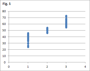
Spread Scatter command in Daniel’s XL Toolbox The above chart shows all the data, but it is very hard to distinguish the individual data points and get an impression of the distribution of the data. Therefore, we use the Spread Scatter function of the XL Toolbox to obtain data clouds.
Select the chart, then click on the “XL Toolbox” tab of the Excel Ribbon, then from the “Miscellaneous” menu, choose “Spread scatter”. (Tip: The online help text on the Spread Scatter function has useful information about the fine-tuning of this function, and explains the informational messages that may come up if several charts in your workbook refer to the same range of cells.)
The chart with the spread-out data points looks like this:
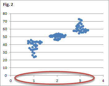
While the data clouds look alright, it is unsatisfying to have the X axis labeled with “1, 2, 3″, rather than informational text.
Step 3: Adding the labels
Let’s assume the data was sampled in an experiment with three groups: “Control”, “Drug A”, “Drug B”. To replace the numbers on the X axis with these labels, we need to add a column chart (bar graph) and hide it.
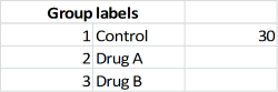
First, enter the names of the experimental groups somewhere on your spreadsheet. As shown in the screenshot, you can add numbers on the left, so it is easier to know which group is which. Notice how there is a number (30) to the right of the “Control” label; this is required to temporarily show the bar graph, so we can select it with the mouse and work with it.
Click on the chart to activate it; click on the “Design” tab of the Excel Ribbon, then “Select data”. Click on “add”, and select the cells with the labels and the cells to the right of them (in this example, the cell containing the 30 and two empty cell). When you click “OK”, Excel will draw an additional point in your chart with a different color. Click on it to activate the new data series. In the “Design” part of the Ribbon, click the leftmost icon to change the chart type. Choose a column chart.

You will notice that the numbers on your X axis have been replaced with the text labels. To hide the additional column, simple delete the number (in this example, 30) that you entered to the right of your first label.
Voilà!

Please let me know if you have any questions.
Post date
Thu 23 Jun 2011Tags
Share
Recent posts
Exit ThinkPad T430s, enter ThinkPad T480s
Linux and VirtualBox on a T480s with high-resolution display
What I like and dislike about Ubuntu 18.04
The following comments were imported from the previous blog software:
David says:
May 8, 2012 at 11:24
It would be great to have this capability for pivot charts / variability charts in Excel. Any thoughts toward further development of this concept? Please see http://www.jmp.com/support/help/Variability_Charts.shtml for reference. Imagine a greater number of data point in each measurement response sub-category. That request made, my sincere thanks to you for making life easier. Your solution on how to output high resolution images of Excel charts gets frequent use.
Daniel says:
May 9, 2012 at 07:58
David, as much as I would like to help you here, it looks fairly complicated to me. I would need to think a lot about how to implement this. The variability charts seem to be a proprietary feature of JMP. Would you have an example for a pivot chart as built into Excel?